📸 How to Choose the Right Image Format: JPG, PNG, WebP, SVG Explained (2025 Guide)
Images are no longer just decorative. In the digital world of 2025, they define your brand, shape your website’s speed, and influence how users connect with your content. From blogs and portfolios to eCommerce stores and mobile apps, the right image format can mean the difference between a bounce and a conversion.
Let’s walk through the four most important image formats — JPG, PNG, WebP, and SVG — with real-world examples and use cases that go beyond theory.
🖼️ JPG (JPEG) – The Time-Tested Hero for Photos
Meet Maria, a travel blogger from Barcelona. She uploads dozens of pictures from every trip — sunsets, street food, and smiling strangers. She wants them to look amazing and load fast on mobile. For her, JPG is the perfect choice.
What is JPG?
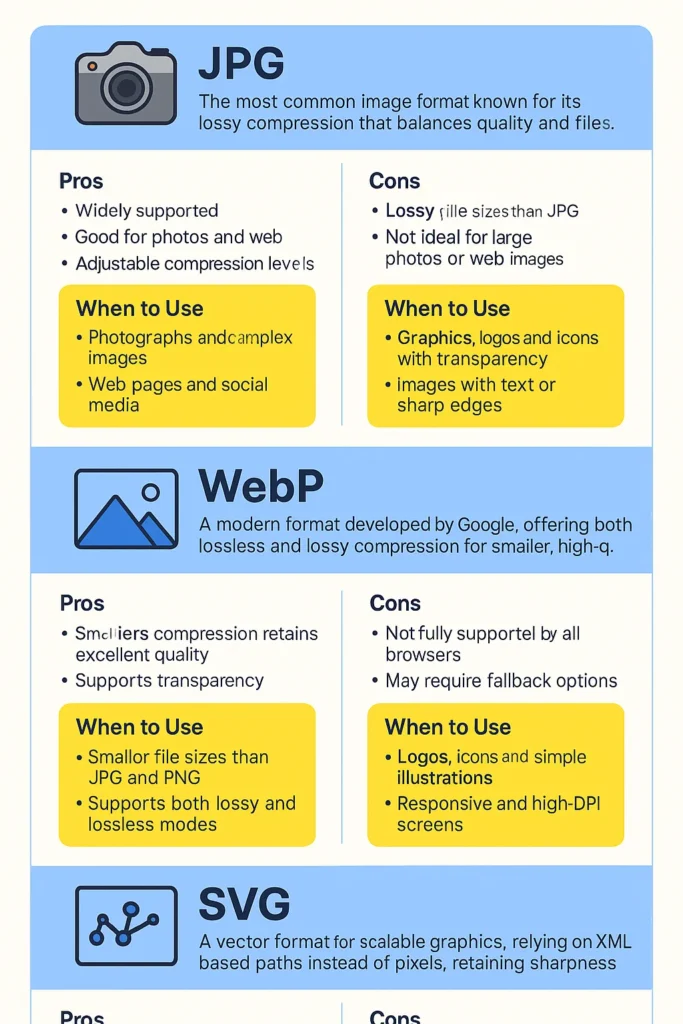
JPG (Joint Photographic Experts Group) is a lossy format, meaning it compresses image data to reduce file size. It’s been around since the ’90s and is supported everywhere — from browsers to image editors and CMS platforms.
Why it’s still popular:
- Compresses large photographs into small file sizes
- Ideal for colorful images with gradients and fine detail
- Compatible with every device and browser
Real-world scenarios:
- Maria uses JPG for all her blog post visuals.
- Online marketplaces display product photos in JPG for faster browsing.
- Social media banners, lifestyle shots, and event galleries rely on JPG.
When to avoid JPG:
JPG doesn’t support transparency and loses quality every time you re-save. Not great for logos or images with text — they can get blurry.
Use JPG for:
- Portraits, travel, food, lifestyle, and real-life scenes
- Social media posts and blog illustrations
- Email newsletters where load speed matters
📦 PNG – The Detail Defender for Transparency and Text
Now meet Jay, a designer who runs an online shop selling illustrated merchandise. His site header has a sleek transparent logo, his buttons are custom icons, and his banners are filled with sharp text. For him, PNG is essential.
What is PNG?
PNG (Portable Network Graphics) is a lossless format, meaning it keeps all the original image data. It’s great for preserving text clarity, sharp lines, and transparency.
Why it’s perfect for UI and branding:
- Supports transparent backgrounds (great for overlays)
- Keeps every pixel intact — no blur
- Best for infographics, screenshots, logos, and sharp-edged graphics
Real-world example:
- Jay’s transparent shop logo floats perfectly on any background.
- His infographic “10 Productivity Tips for Designers” is in PNG to keep text and lines crisp.
- He uses PNGs for product mockups on T-shirts and mugs.
Downsides?
PNG files are heavier. If you’re not optimizing, your site could become sluggish. Use tools like TinyPNG, Squoosh, or ImageOptim to compress without quality loss.
Use PNG for:
- Logos and watermarked images
- Screenshots, charts, and graphs
- UI/UX elements, buttons, and icons
- Custom artwork needing transparency
⚡ WebP – The Speed Demon of the Web
Jasmin runs an online clothing store. Her homepage has dozens of product images — all loading fast. Her site scores 95+ on Google PageSpeed. Why? She switched to WebP.
What is WebP?
Created by Google, WebP supports both lossy and lossless compression and delivers excellent quality with significantly smaller file sizes than JPG or PNG.
Why performance lovers adore it:
- 25–35% smaller than JPG/PNG
- Supports transparency like PNG
- Works with animations (GIF replacement)
Real-world example:
- Jasmin replaced JPGs with WebP for her product grid. Her mobile load time dropped from 5.1s to 2.2s.
- Travel sites and recipe blogs that include multiple images per page now load twice as fast.
- Most image optimization plugins (like ShortPixel or Smush) now default to WebP.
Is it compatible now?
Yes! As of 2025, nearly all modern browsers — including Chrome, Safari, Firefox, and Edge — support WebP natively. Even WordPress, Canva, and Shopify have integrated WebP.
Use WebP for:
- Online shops and portfolios
- Blogs with many inline visuals
- Homepages where speed affects rankings
- Converting old PNGs or JPGs to modern formats
Pro Tip: Use a plugin or CDN that converts your original images to WebP on-the-fly — no manual resizing needed.
🔤 SVG – The Smart Vector for Designers and Developers
Let’s talk about Emily, a front-end developer building a responsive landing page for a startup. Her icons, animations, and logo need to scale perfectly on all devices — from smartwatch to smart TV. SVG is her format of choice.
What is SVG?
SVG (Scalable Vector Graphics) isn’t pixel-based. It uses XML code to create lines, shapes, and fills. That means it scales infinitely without losing sharpness.
Why SVG stands out:
- Ultra-lightweight — just code, not pixels
- Perfect for logos, icons, charts, and illustrations
- Can be styled with CSS and animated with JavaScript
Real-world usage:
- Emily uploads her startup’s logo in SVG — it looks crisp even on 4K monitors.
- Developers use SVGs for interactive buttons, animated loaders, and responsive icons.
- Designers hand-code SVG illustrations for ultra-clean website visuals.
Limitations?
Not suitable for detailed photos or textures. SVGs are best for simple or stylized designs, not real-life imagery.
Use SVG for:
- Brand logos (especially those appearing everywhere)
- Icon packs and navigation elements
- Custom illustrations and vector graphics
- Data visualizations and interactive graphics
🎯 Final Thoughts: Match the Format to the Function
The best websites in 2025 don’t rely on just one format — they mix and match.
Here’s a quick cheat sheet:
| Format | Best For | Avoid For |
|---|---|---|
| JPG | Photos, realistic scenes, fast load | Logos, overlays, re-editing |
| PNG | Logos, text graphics, crisp edges | Heavy image sets, slow pages |
| WebP | Speed-focused sites, mobile-first content | Some legacy platforms |
| SVG | Scalable UI elements, logos, code-friendly graphics | Photos, texture-rich images |
💡 Real Tip from Real Creators
“Switching to WebP images helped me cut my homepage load time by half. But for my logo, I stuck with SVG because I wanted pixel-perfect scaling everywhere.”
— Ravi Malhotra, UI/UX Designer
“When I uploaded my illustrated designs in PNG to Redbubble, they looked crisp and clear on all products — especially mugs and phone cases.”
— Disha Arora, Independent Artist
✅ Final Advice: Let Purpose Drive the Format
- Running a blog with beautiful travel stories? Stick to JPG.
- Designing brand assets or infographics? PNG or SVG will give you the sharpest results.
- Want faster site performance? Convert everything to WebP.
- Building scalable design systems? SVG is your best friend.
The secret isn’t picking the “best” image format — it’s choosing the right one for the job.